KT 비주얼 아이덴티티 리뉴얼

1. 40년의 유산에서 AI 컴퍼니로
통신 인프라를 구축해 온 KT가 전통적 통신사를 넘어 미래지향적인 AI 테크 기업으로 확장하는 전환을 시각화했습니다.
- 기존 CI의 유산을 지우지 않고 새로운 기술 환경에 맞는 형태와 움직임으로 다시 해석했습니다.
- 익숙한 정체성은 남기되 브랜드가 향하는 미래와 확장성을 더 선명하게 드러냅니다.
- 변화의 중심을 새 로고 하나보다 기업의 성격과 경험 전체를 바꾸는 브랜드 트랜스포메이션에 두었습니다.
2. Flag와 Signal Flow
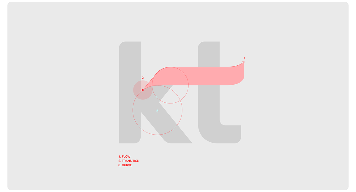
깃발과 눈에 보이지 않는 신호의 흐름을 연결해 KT만의 유연한 시각 모티프를 만들었습니다.
- 바람에 따라 형태와 방향이 달라지는 깃발은 환경에 반응하며 계속 변화하는 브랜드를 상징합니다.
- Flow·Transition·Curve가 연결과 확장, 변화의 유연성, 사람을 향한 온기를 함께 표현합니다.
- 네트워크와 신호의 흐름은 입체적인 빛과 유기적인 곡선, 리듬감 있는 움직임으로 시각화됩니다.
- 통신 기업의 기술적 기반이 AI 시대의 ‘Intelligence Flow’로 자연스럽게 이어집니다.
3. 빛과 에너지로 확장한 KT Red
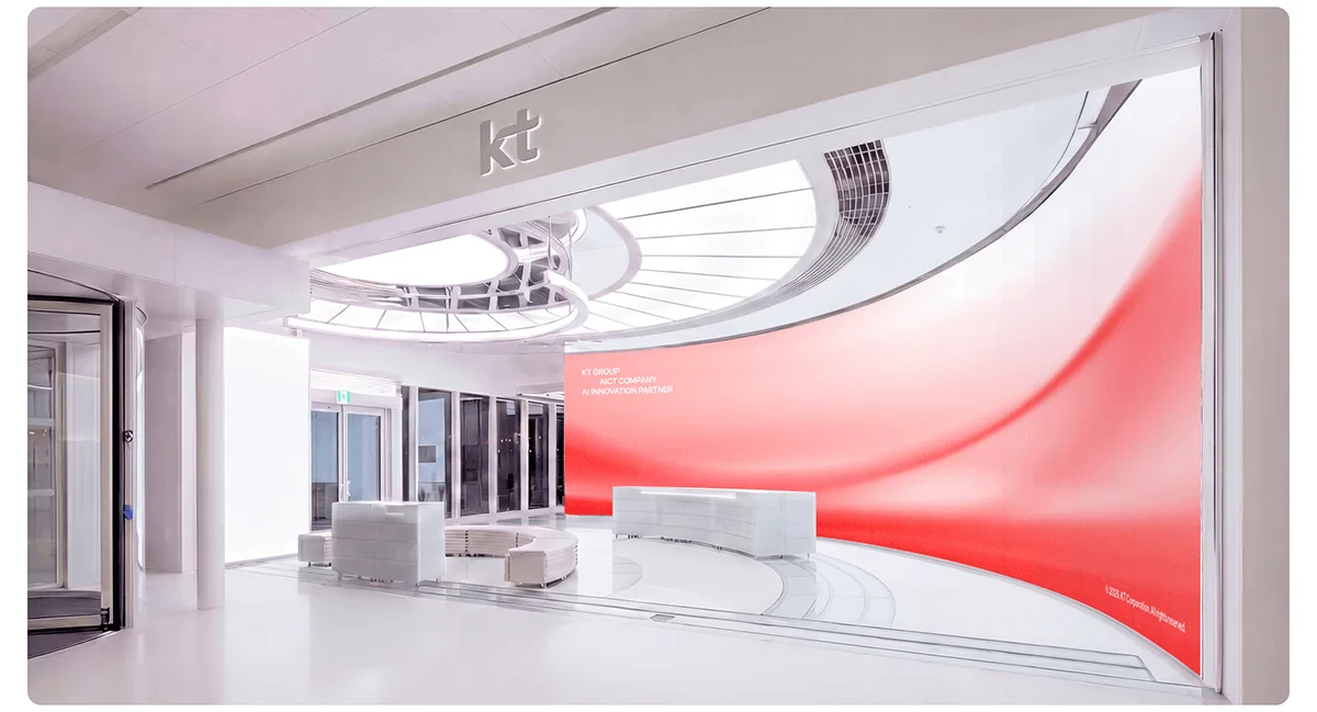
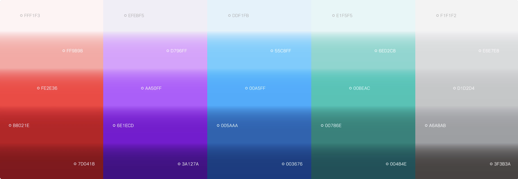
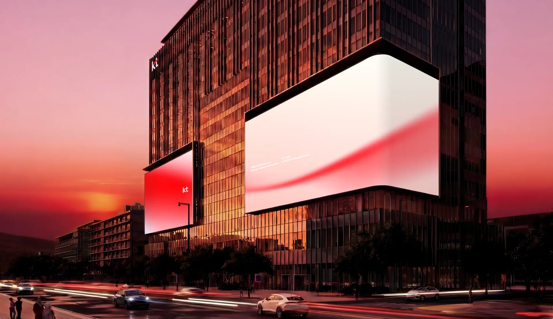
KT의 상징색은 고정된 붉은 면이 아니라 공간과 화면을 가로지르는 빛과 에너지로 확장됩니다.
- Red를 중심으로 퍼플·블루·틸을 더하고 반투명 레이어, 빛 번짐, 유리 같은 재질을 조합했습니다.
- 첨단 기술의 정밀함은 유지하면서도 차갑지 않은 인상을 만듭니다.
- Blender 3D와 After Effects를 활용한 입체·모션 표현은 디지털 스크린에서 아이덴티티의 흐름을 더 선명하게 보여줍니다.
- 정지 그래픽에서도 곡선과 그라디언트가 같은 움직임의 여운을 남깁니다.
4. 반복해서 운영되는 브랜드 시스템
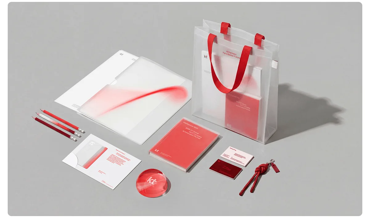
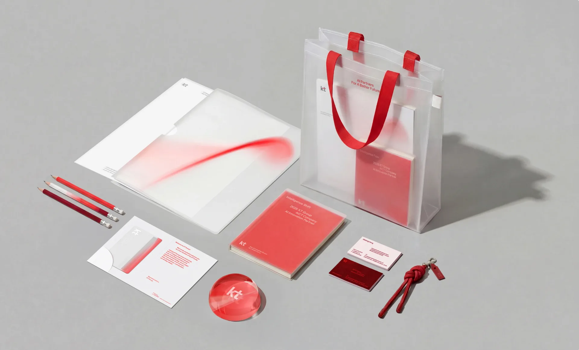
형태와 색의 원리를 타이포그래피, 아이콘, 공간과 실물 제작물까지 연결해 실제로 운영할 수 있는 체계를 만들었습니다.
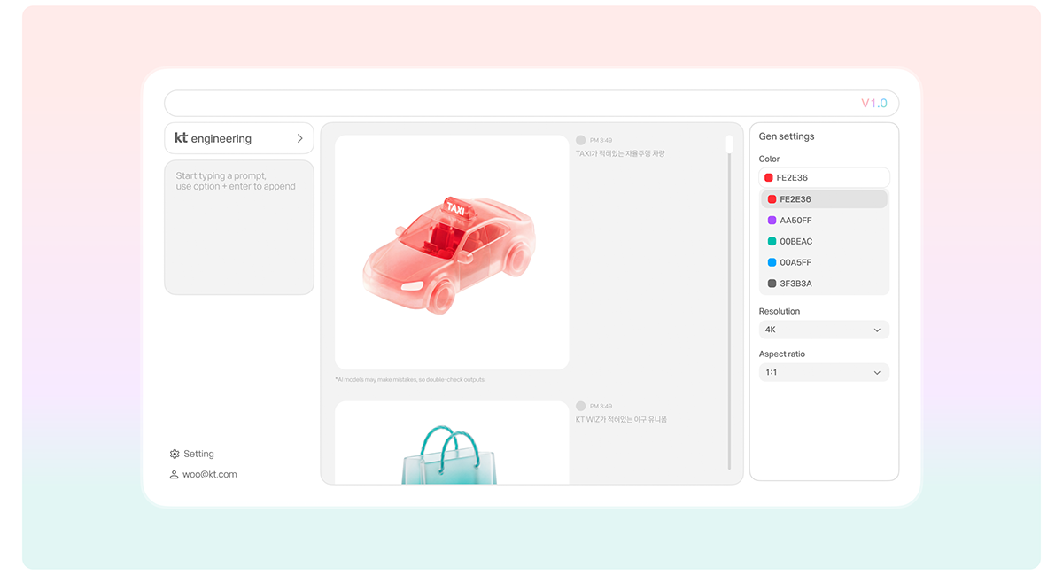
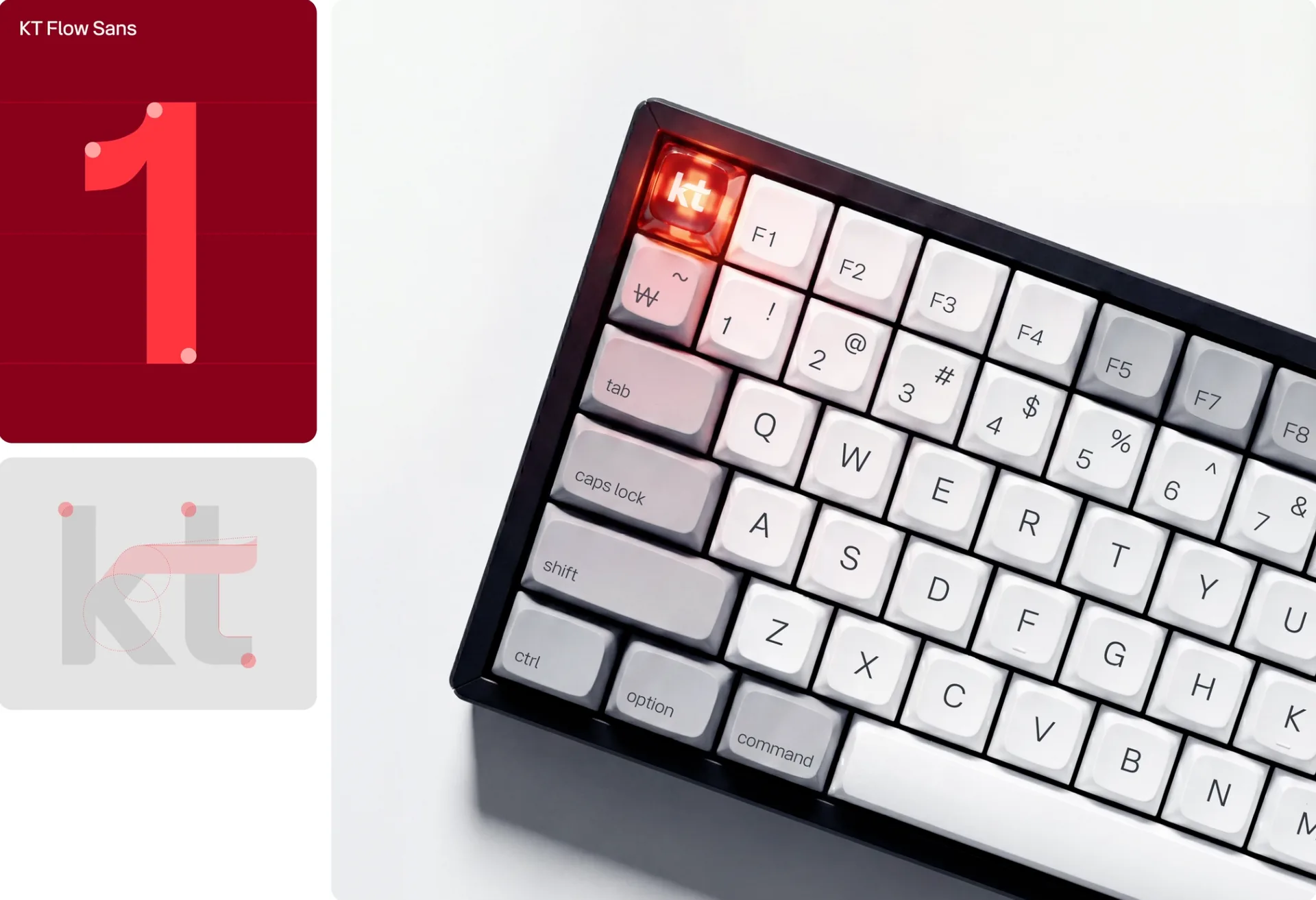
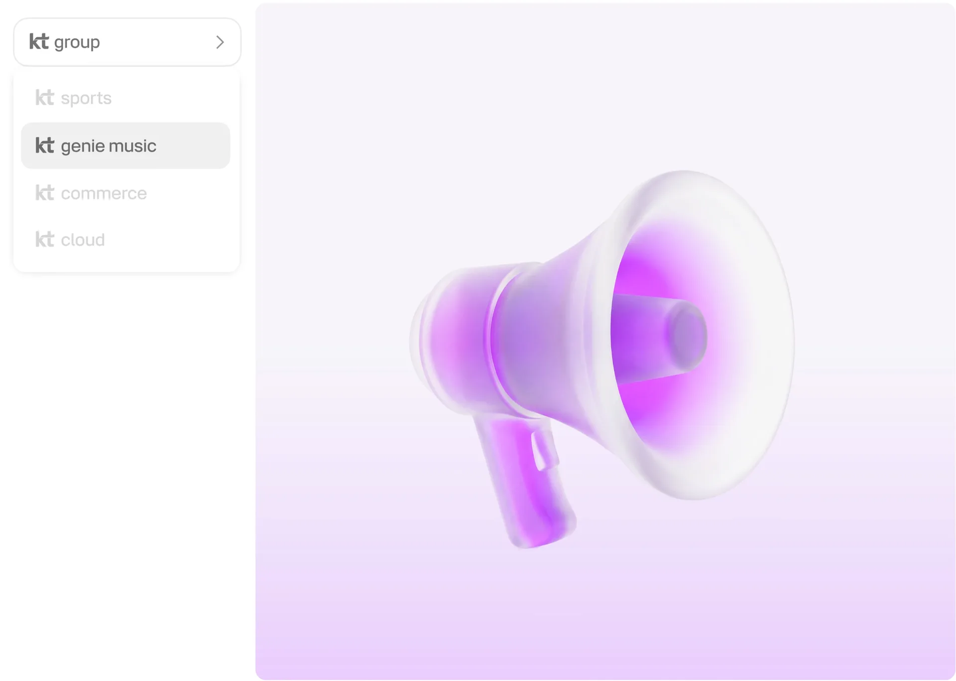
- 전용 서체 KT Flow와 AI 아이콘 생성 시스템은 서브 브랜드와 서비스별 표현을 같은 원리 안에서 확장합니다.
- 그래픽 자산을 매번 새로 만드는 대신 일관된 규칙으로 계속 증식할 수 있습니다.
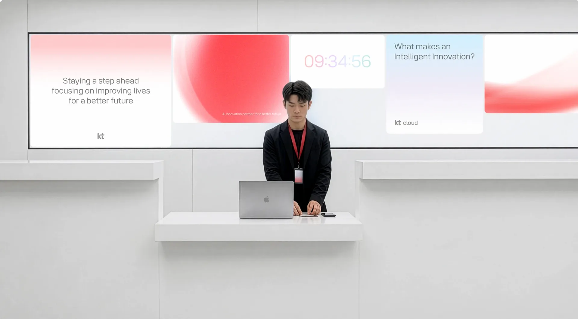
- 오피스 사이니지, 미디어월, 명함과 문구류, 디지털 인터페이스에서도 같은 곡선과 색감이 이어집니다.
- 매체마다 표현은 달라도 ‘흐름’이라는 브랜드 인상은 끊기지 않습니다.