Manchester City Women: A Distinct Brand Built Around Its Fans


1. Why a distinct brand became necessary
Manchester City Women built a visual identity suited to their own supporters and stories.
- Club research found that women-first supporters were predominantly women, younger people and families, and were more likely to belong to the LGBTQ+ community.
- The league and FA Cup double in the 2025/26 season clarified the need to communicate the women’s achievements and individuality consistently.
- It’s Nice That describes this as the first WSL identity distinct from an associated men’s team.
2. A ‘light trail’ added to the club’s heritage
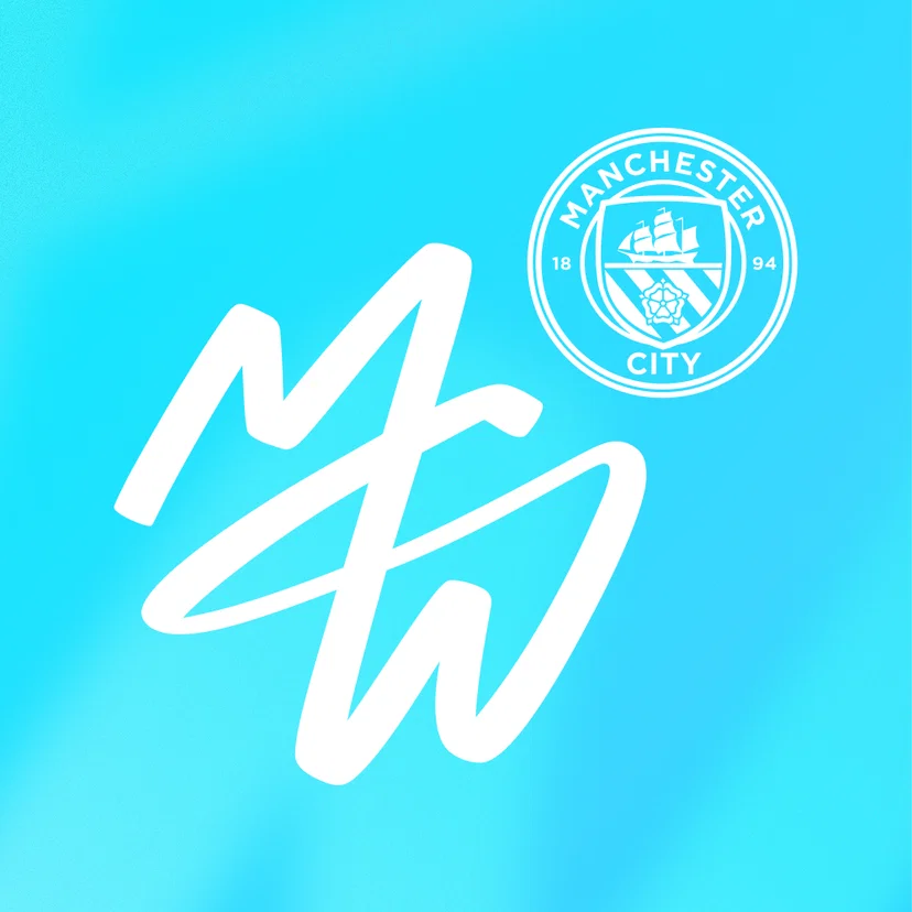
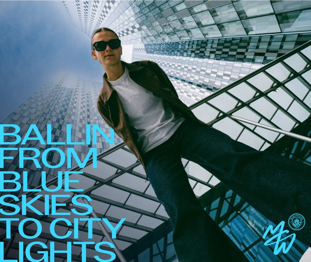
Nomad retained the existing crest and sky blue while introducing a monogram of the women’s own.
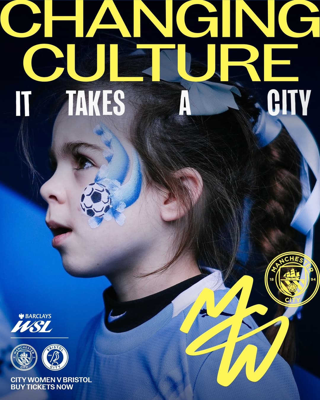
- The monogram joins M, C and W in one flowing gesture. Internally called the ‘light trail’, it represents lighting the way for others.
- While the existing crest carries the club’s history and affiliation, the monogram gives the women’s supporters something to embrace as their own symbol.
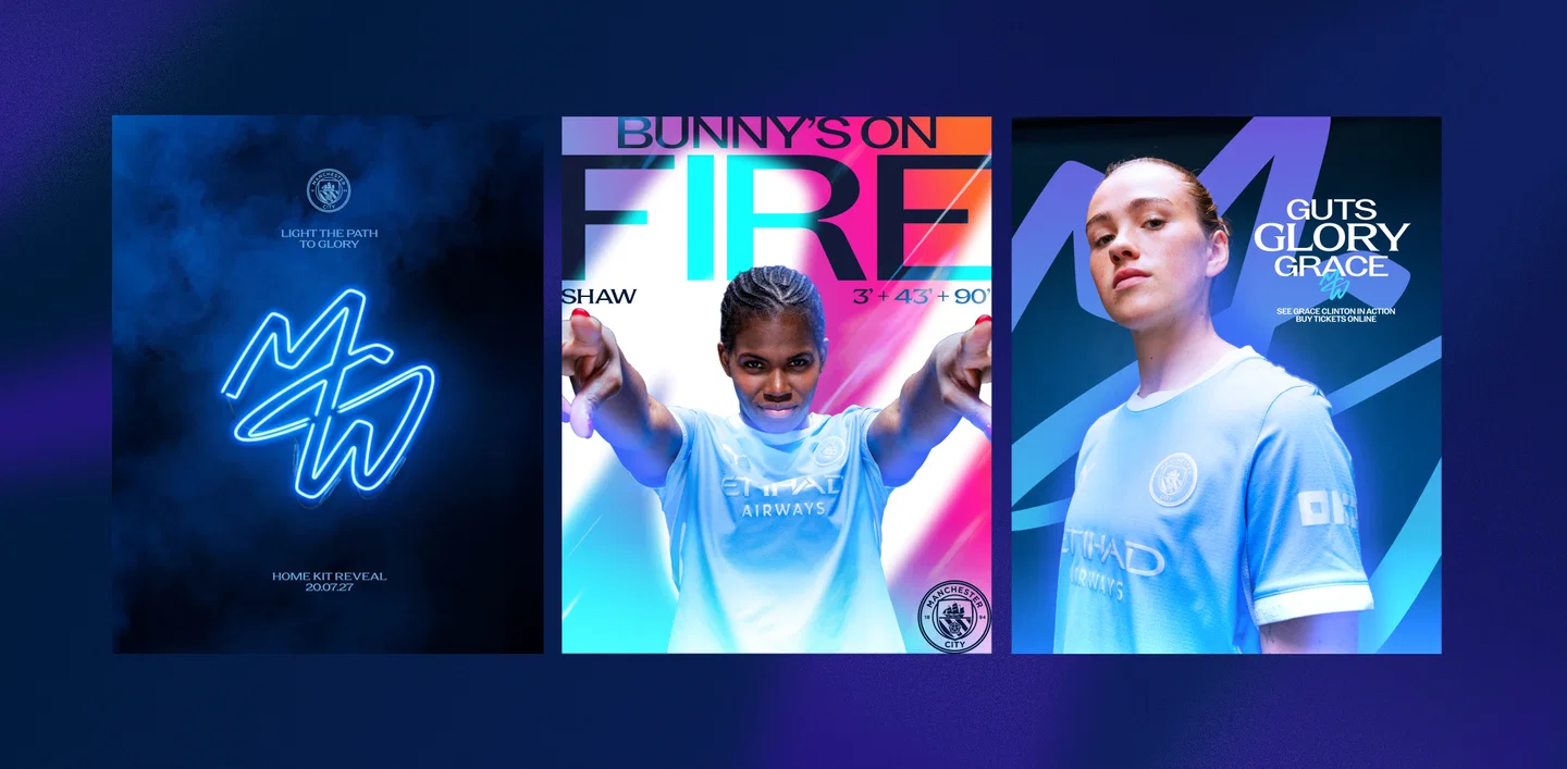
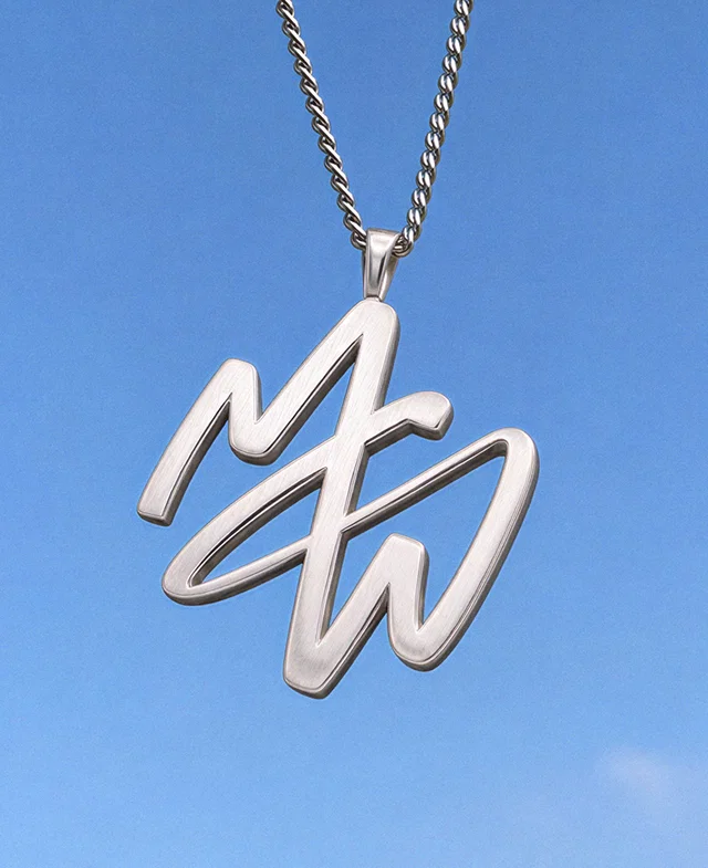
- Neon and chrome treatments, together with a pendant mockup, show its potential to extend beyond match promotions into objects worn in everyday life.
3. Different expressions from shared assets
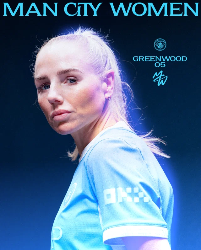
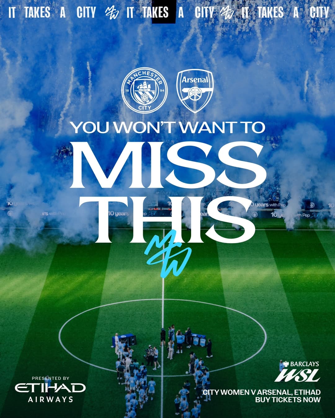
Recurring typography and monograms combine with varied colours and photography to connect different content through one team’s visual language.
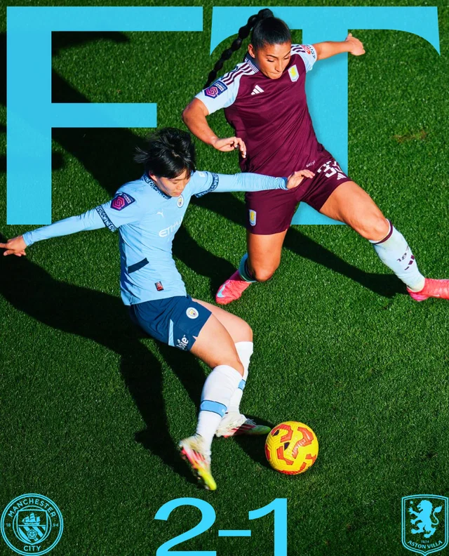
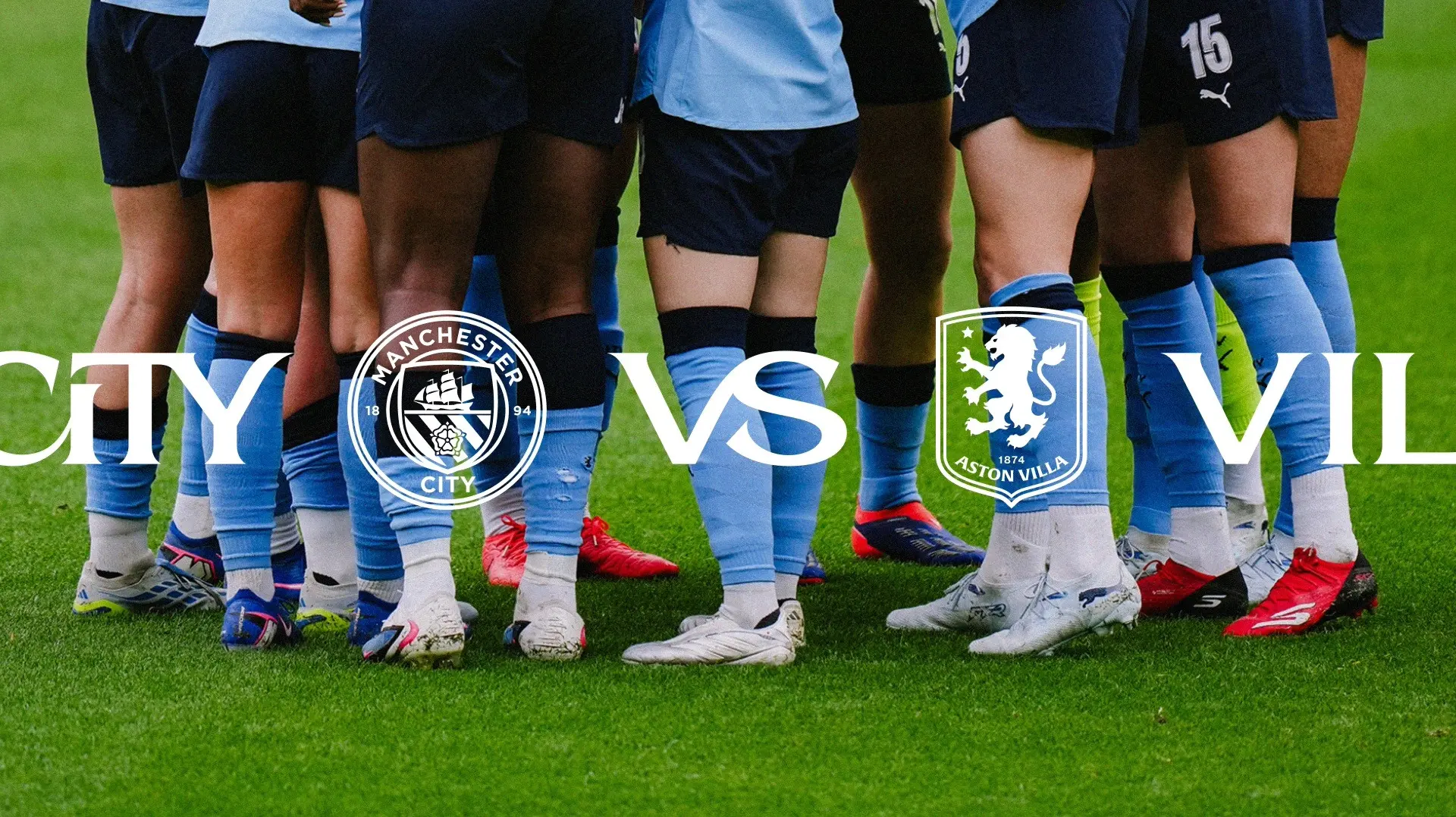
- Two custom styles extending the existing Kippax typeface, a sans and a serif, create different rhythms for large headlines and match information.
- Sky blue stays central, with yellow, purple and neon tones changing the mood of player introductions and match previews.
- Visually, the contrast between ordered typography and the free-flowing monogram stands out. Consistency comes from combinations of shared assets rather than a fixed layout.
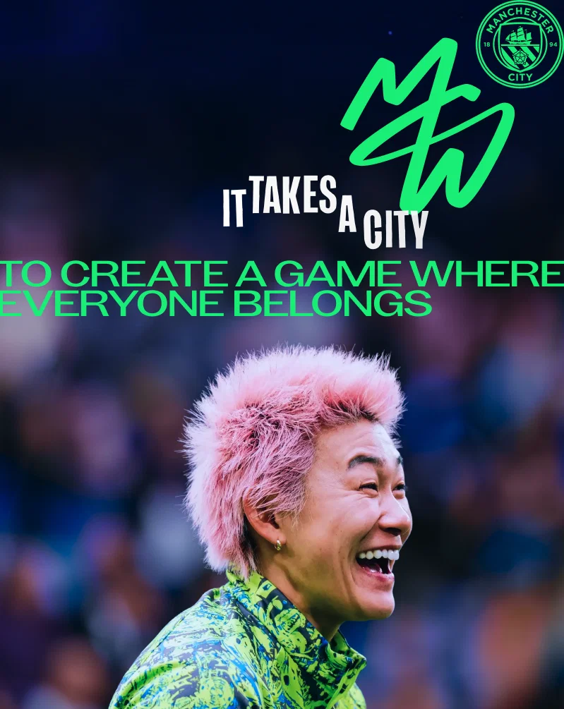
4. ‘It Takes a City’: a brand that includes its fans
The message that a whole city makes it happen connects players, staff and supporters as one community.
- The slogan grew from the deep connections discovered in interviews with players and fans from the official Supporters Club.
- A poster placing a young fan at its centre and player imagery emphasizing belonging present supporters as protagonists in the brand too.
- From a branding perspective, the monogram reads as a shared community marker, and the slogan as a reason to rally together.