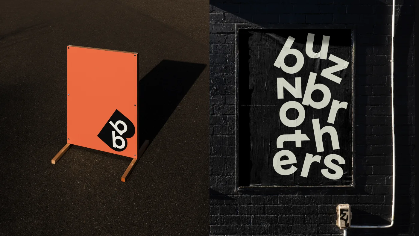
BUZZ BROTHERS: A Rebrand That Turns Team Energy into Motion


1. Redefining the brand at its 16th anniversary
For its 16th anniversary, BuzzBrothers translated its team's energy and sense of connection into a visual language.
- The redesign spans brand strategy, digital assets, layout, and a motion system.
- Its starting point is how to express the energy of people working together.
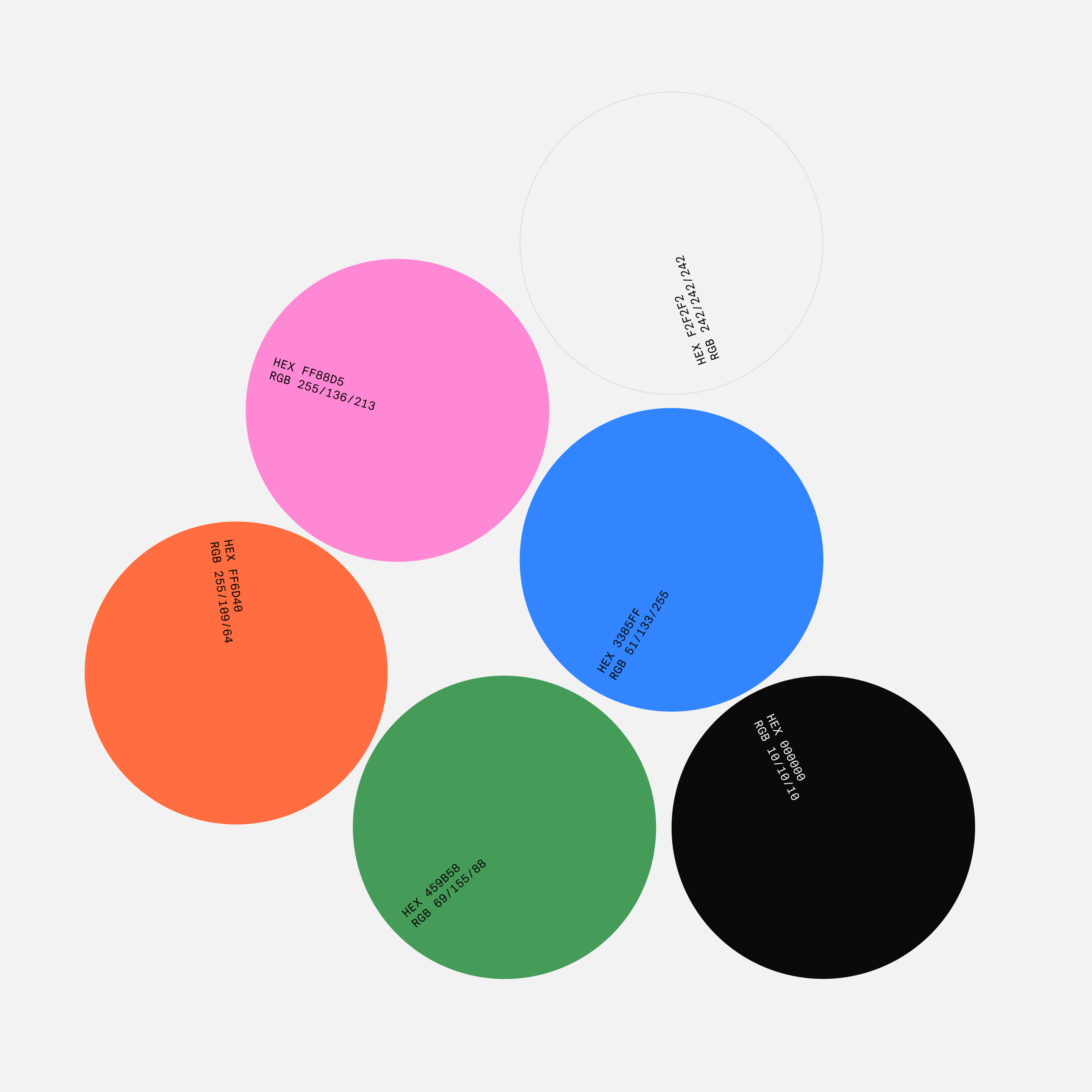
- Movement and color carry that idea throughout the brand.
2. Making motion the brand's basic language
With motion at the center of the visual identity, the project expands how letters and graphics can express the brand.
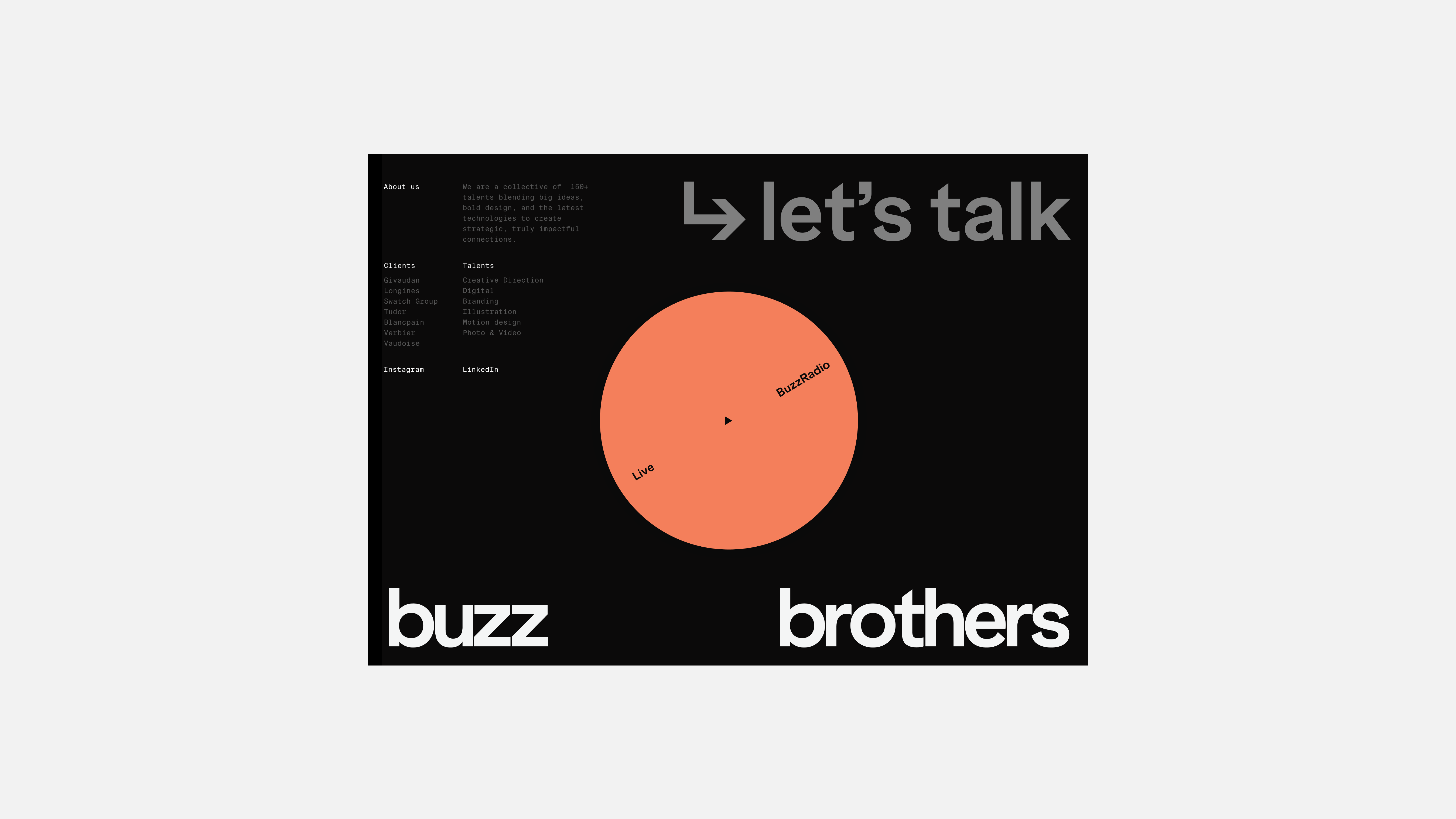
- An aligned wordmark communicates the brand name clearly.
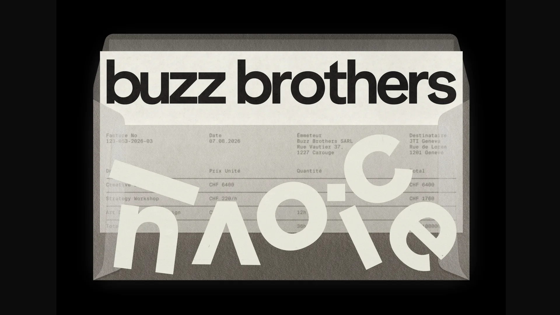
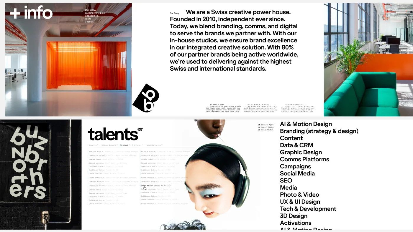
- Freely rotated and scattered letters bring rhythm and energy to the composition.
- This contrast suggests movement even on static posters and document envelopes.
3. Maintaining a recognizable impression across media
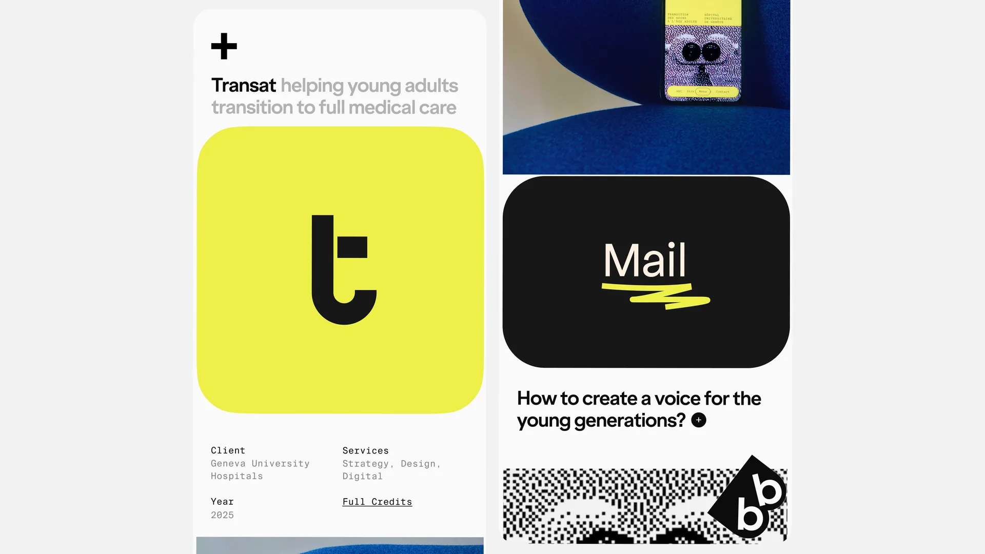
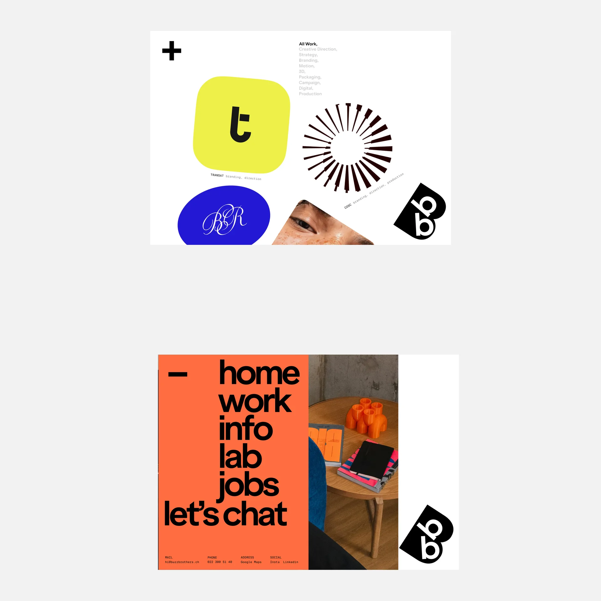
From mobile screens to print and tote bags, the same visual elements are adapted to each medium.
- Initials appear on mobile screens, while oversized letters and vivid orange appear on tote bags.
- Rather than repeating an identical composition everywhere, the design adjusts letter size, placement, and color combinations.
- Compare the applications to see which elements make the brand recognizable in each medium.