7월 25일 토요일
7월 25일 토요일
7월 25일 토요일
7월 25일 토요일
7월 25일 토요일

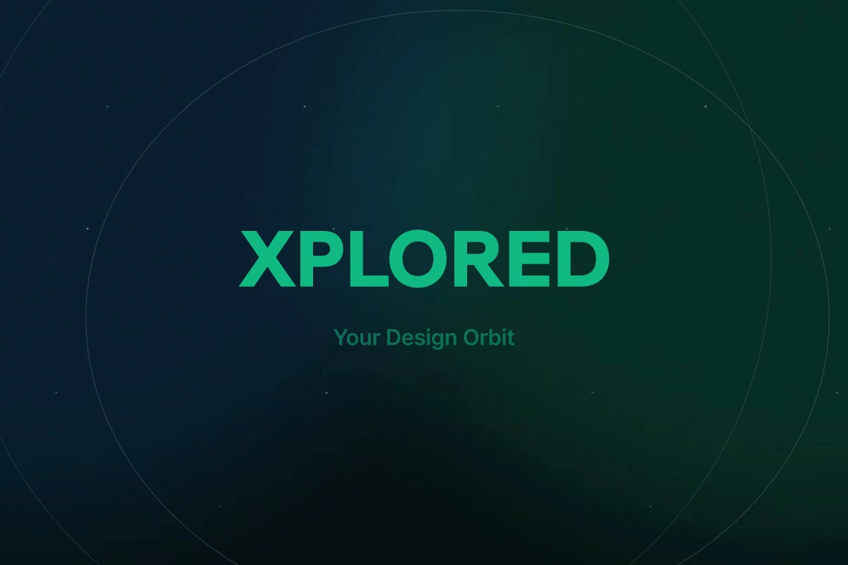
We see a designer's journey through tools and references as an orbit. The concentric rings on the cover trace that orbit of exploration, and the wordmark sits at the point where the orbits converge. The X is both the first letter of XPLORED and the mark on a map for what hasn't been explored yet.
The canvas is a deep navy black (#0B0F14); the signature is emerald green (#34D399). On a dark screen the content thumbnails stay the hero, so the brand color appears sparingly, like a signal. The green runs on an 11-step token scale (brand/50–950), and every state and accent in the product UI moves within that scale.
The same symbol and palette carry through project covers, OG images, the favicon, and UI components. The brand isn't decoration layered on top — it lives in the codebase as design tokens, so new screens never drift out of orbit.